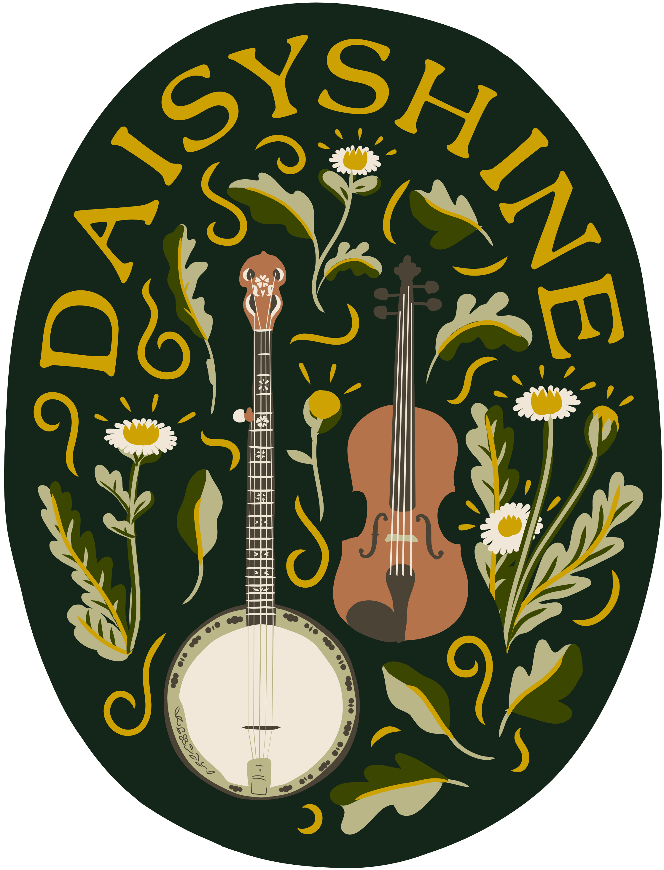
Daisyshine, Folk Duo
Branding Project
Working with Daisyshine, an old-time Appalachian folk duo, was an opportunity to bring their authentic music to life through branding. Martin on banjo, and Lucy on fiddle, create a harmonious blend that's deeply rooted in tradition and their brand needed to reflect that same timeless folk-inspired essence. Drawing from the rich visual language of Appalachian folk art and old-time brands, we set out to craft a brand identity that would resonate with their unique style and musical heritage.
Lucy Roberts
“I love how the design works against different coloured backgrounds, and both with and without the instruments. Thanks for all your hard work! It feels just right, Folksy Old Time Fiddle and Banjo with a contemporary twist, and would all look lovely on tote bags, t-shirts, and pin badges!”
The Brand
The branding process for Daisyshine was deeply rooted in the Old Time Appalachian style, heavily influenced by American folk art. The mood board played a critical role in shaping the brand, guiding the selection of colours and design elements that aligned with the duo’s style. The colour palette was carefully chosen, incorporating hues from the daisy flower and its leaves, the lighter tones of a banjo, the wood of the fiddle, and the deeper greens of the Appalachian forests. We wanted to create a detailed logo that balances intricate graphics with versatility. This was a creative challenge, but by creating both detailed and simpler variations, we developed a diverse set of logos that Daisyshine could use in various ways.
The logos draw heavily on traditional American sign painting, a style known for its intricate spirals and flourishes that lend a timeless, handcrafted feel. These elements, typical of old Americana, are seamlessly woven into the design, complimenting the natural motifs of daisies, leaves, and the intimate instruments, central to the duo’s identity. The font was carefully selected to harmonise with the graphics, providing a balance between bold legibility and the delicate, detailed nature of the illustrations. We used bold block colours for versatility, and more intricate designs that employ the full colour palette. This approach allows Martin and Lucy to maintain a consistent, yet flexible, visual identity, whether they are using logos on merchandise, album covers, or promotional materials.
Brand Logos


